

Faq
How should I supply artwork to Mindvision for promotional merchandise?
Ideally, artwork should be supplied as an Adobe Illustrator vector file although in some cases a PDF is also fine.
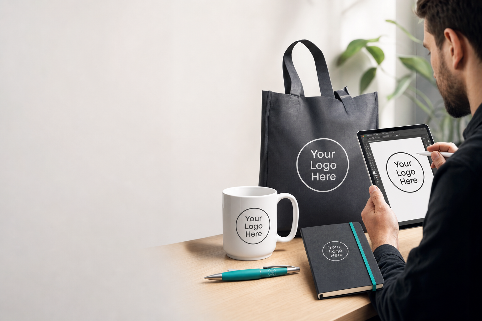
Where should I start when preparing artwork for branded items?
Helps the customer decide the first steps and what to check before sending files.
Begin by checking the final product and its printing or decoration method (print, embroidery, engraving). Different methods favour different file types and artwork details, so understanding the end use guides how you prepare artwork.
Useful quick checks:
- Confirm which item(s) you’re ordering and where the logo will sit.
- Decide if the artwork needs to be single-colour, full-colour, or embroidered.
- Gather original logo files, fonts and any brand guidelines.
Next step: compile your logo and any guidelines, then contact us to confirm the preferred formats for your chosen decoration method.
What file formats do you prefer—vector or raster?
Explains the differences between vector and raster files and when each is suitable.
Vector files (AI, EPS or editable PDF) are usually preferred because they scale without quality loss, which is important for crisp logos and text. High-resolution raster files (PNG, TIFF, PSD) can be acceptable for photographic or detailed artwork when supplied at a sufficiently large size.
When to use each:
- Vector: logos, line art, text and items requiring precise scaling.
- High-res raster: photos, complex imagery or when vector originals are unavailable.
Next step: if you don’t have vector files, send the highest-resolution originals you have and we’ll advise on suitability.
Which colour formats should I use for print or embroidery?
Guides customers on colour approaches and what to confirm when colour accuracy matters.
Colour handling depends on the decoration method. Print processes commonly use CMYK; many brands specify spot colours (Pantone) for exact matches. Digital files from screens are often RGB, which may need conversion. Embroidery uses thread colours and won’t reproduce photographic colour subtleties.
Best practice:
- Provide Pantone references where exact matches are important, if available.
- Supply files in CMYK for printed items or indicate when artwork is RGB.
- Expect embroidery to be a simplified interpretation of complex colour blends.
Next step: tell us which item and colour fidelity you need so we can advise the best approach for accurate reproduction.
How should I prepare files and organise artwork layers?
Covers practical file setup and organisation to reduce back-and-forth and avoid common issues.
Organised files speed review and production. Use single artboards for each layout, group elements logically, and keep text on separate editable layers. Avoid hidden or unused layers and clearly label files with project name and version.
Checklist:
- Include a separate file for each print placement or colour option.
- Keep logos and colour elements on their own layers.
- Supply linked images at full resolution rather than embedded low-res previews.
Next step: export a PDF or package your native file (if possible) and share it with any notes about placements or alternative layouts.
What should I do about fonts and logos in my files?
Explains how to handle text and font issues to prevent missing fonts or layout changes.
Fonts can shift if not provided. Convert text to outlines/curves to preserve appearance, or include original font files if you need editable text. For logos, supply the original vector whenever possible and include any alternative logo versions (mono, reversed, stacked).
Practical tips:
- Outline text when you want to lock appearance.
- If keeping text editable, supply the font files or a licensing note if required.
- Provide multiple logo variants and a short usage note (preferred version for light/dark backgrounds).
Next step: either outline your fonts or attach the font files along with logo variants and preferred usage instructions.
How do I handle complex artwork, gradients or photographs?
Advises on handling non-vector artwork, gradients and photographic elements and their limitations for various decoration methods.
Gradients and photographs can reproduce well in full-colour print but may need simplification for techniques like screen printing or embroidery. For small or tactile decorations, consider a simplified or flat-colour version of the artwork to maintain clarity.
Options to consider:
- Provide high-resolution raster files (300dpi or higher) for photos and detailed prints.
- Create simplified artwork with solid colours for embroidery or small print areas.
- Offer an alternative single-colour logo for certain decoration techniques.
Next step: share the full-colour source plus any simplified alternatives and specify which items you want each version for.
What happens after I send my artwork—how is it checked and approved?
Describes the review process and the customer’s role in approving artwork before production without promising timings or outcomes.
Once we receive artwork, our team will review files for technical issues (resolution, colour mode, missing fonts or low-quality assets) and advise on any changes needed for a chosen decoration method. We’ll propose adjustments or ask clarifying questions if necessary.
Typical stages:
- Initial technical check and feedback on any issues.
- Preparation of a print or embroidery proof for your approval.
- Your approval of the final proof before moving to production.
Next step: send your files and any brand guidelines; we’ll review and outline the next actions and any recommended artwork changes.